Sunday, October 27, 2013

Easy DIY spray painted frames

 Hello!
I've been missing for a while.  I am back.  When I started this blog, I never realized how time consuming it can be!  So, I just quit putting any time at all into it, and I realized that it missed me:)  haha I just finally have something to write about really.  We have been working on our master bedroom/bathroom since May.  Yes, 5 months.  No, it is still not finished.  And no, we aren't doing anything super extravagant either, I've just honestly been lazy and haven't wanted to work on it every waking moment like usual.  So instead, I've been in a constant bad mood for 5 months every time I walk in our bedroom.  I can finally say, our bathroom is ALMOST finished, and our room is about 75% there.  Cross your fingers I can get my butt in gear and be done by Thanksgiving.   In the past, I've only ever posted before and after total room reveals.  (Well I've done 3 ok?!)  So with this post, I just wanted to do a small one and get back into the swing of this blog thing.  So there were a couple DIY projects that I did for the bathroom, so I wanted to share.  The next post (in the next week HOPEFULLY!!!)  will be the whole bathroom reveal.  I love it.  It turned out amaze.  Anyway..I have been Inspired by anything gold,  and I'm finding myself wanting to use it everywhere! I  wanted to try an easy project that would add a huge impact to the walls.   I found frames on clearance at target for less than $10 each, and so I knew if I screwed them up, it wasn't a huge investment:)  I've seen them in all different colors, but we wanted to incorporate red as an accent color, so I spray painted them red, let them dry a couple hours (really less than a couple hours..I'm impatient) and taped off the corners praying that the red was dry.  I then used gold spray paint to paint the corners of the frames.  I love them!!!!  They turned out just how I envisioned!!  I am not a very good blogger because I did not take any before pictures of the frames, but they started out as metallic silver.  Just picture that in your mind for the before picture.  I used red and gold one two, and black and gold on the other. Really only because I ran our of red spray paint:)  I'm not very prepared sometimes when it comes to diy projects...I never really have it planned out when I'm going to start, then I get a hair up my butt one day, and decide I want to do it right that very second.  So anyway, 2 red, 1 black!
   
I had been obsessing over this Hey Y'all print I saw on Instagram, and finally decided I needed it.  I ordered it from www.stephaniecreekmur.com .  She is a very talented designer who has tons of prints all with southern sayings!  I love all of them, but settled on the Hey Y'all sign!  I love how it looks!! The other two prints were designed by my husband, and available in our  Etsy shop! Brockpaperscissor.etsy.com


This one is one of my absolute favorites!  I am a true believer in this saying:)   Our dogs are one of the biggest joys in our lives, and I am consumed by them.  I love them dearly.  So I kiss them daily:)


I took two sewing classes this past year, and so now I'm basically an expert.  Haha I wish.  Sewing is one of the hardest things ever for a very impatient person.   Which I am.  I hate measuring (anything really...in baking, sewing, hanging pictures) so I honestly just measure with my eyeballs, cut, and hope it all lines up.  Believe me, until I can perfect this hobby a little more, I wouldn't ask me to sew your new $50.00 per yard fabric drapes:)  Anyway, with all that being said, I did manage to whip up this curtain, and it really doesn't look half bad.  It is actually pretty darn straight.  I also love everything that has pom pom fringe on it, and wanted to mimic some curtains I saw on Pinterest.  In the end, it turned out exactly how I hoped!   did have my fingers crossed the whole time.....  I hung the curtain rod about 6 inches higher than the window because I wanted to give the illusion that the window was actually bigger than it is.  Our bathroom is very small, and so I try to fake it when I can!  Hopefully in the next week we are fully finished with our bathroom, and I will post all the before and after pictures!  It started out as a hot mess!!  We love the the final outcome!

Wednesday, June 12, 2013

Can a sunroom be a sunroom with only one window? Yes.

In this house it can.
I wasn't sure what I wanted to use this room for when we bought the house, but I was excited about it being an amazing use of extra space right off our living room.  This room started out as a dark and dingy hole, and was kind of a catch all for all our junk until I figured out what I wanted to use the room for.  Eventually this will make an awesome play room, but until that very distant future date, I decided on a sewing, reading, work out (hahahahaha) room.  Its totally a work out room if the treadmill is in the room right?  Even if I do use it to hang fabric on:)  I played around for a while with paint colors, trying to decide if I wanted to go with a bright color on the walls, (we love color in this house obv) but ultimately I decided on a more neutral color with the white board and batten.  I knew the white wood treatment covering most of the wall would really brighten the room up!  Im obsessed with wood walls, and I love how big of an impact they can make in a room!  We did 3 walls in the sunroom, and one accent wall in the living room.  Ill post on that later:)  The color we used on the walls is Chinchilla by Martha Stewart paint in satin finish, which is the same color we used in the entry way.  For the white wood work, and the brick wall, we used High Gloss White by Behr.
Here are some before pictures of what was the ugliest room in the house.


Pinterest saved the day again with ideas for the board and batten.  My super handy husband tackled this project all on his own, and it turned out amazing!!


Along with my obsession with IKEA, Craigslist is also up there on the list.  Did you know they have an app?!?!  Totally takes my junking to a whole new level!  Anyway, I scored this really cool
daybed to use as a couch for $25!  I wanted to offer $20, but Brock informed me that was rude....haha isnt that what Caigslist is about?  I painted it High Gloss Black by Behr, bought a mattress, added the bedding, and I love it!  Elph, my 6 year old bulldog, also loves it.. have I mentioned that they shed so much I wonder how they have any hair left on their bodies??  So, she only gets to enjoy the bed if shes being super sneaky..


This room used to be the outdoor covered patio before the previous owners enclosed it.  So they added two double doors out to the room, and boarded up the old existing door.  We painted the brick white, and covered up the old space where the door used to be with some wood planks,  added a new light fixture, and now I can sew in peace!


There were a lot of DIY projects in this room.  The WONDERFUL board and batten treatment was the most time consuming.  I made the curtain for the door , and added some trim of the same fabric to the white IKEA curtain panels for the window.  The black and white striped pillows (I reeeaalllyyyyy like black and white..and stripes) I sewed (is that a word?) from fabric I found at non other than IKEA.  Also from my fav store is the rug, and accent pillow on the bed!  The framed pictures of the dogs were hand drawn by Brock.  He was pretty stressed out about it when I asked him to sketch the girls, so I gave him five minutes to do each, and they turned out amazing.  I bought cheap hoblob frames, and spray painted them gold.  I love gold.  And spray paint.  The 'swim' letters are also from hoblob, they are cardboard letters that got a coat of navy spray paint.  I became obsessed with this paint color called Habanero Pepper by Benjamin Moore paint after seeing it on an entertainment center in HGTV magazine.  For one crazy second I wanted to paint the whole room that color, then I got a grip, and went for it on the back door.  I think its the most amazing color ever!  Is it orange?  Is it pink?  I think its a different color everyday!!   One of my favorite things in the room is a vintage tea cart I found at a thrift store.  The original intent was to use it as a bar cart, but I couldnt find the right place for it in the living room, so as of now its sittin pretty until I figure out a better use!  Im loving green right now, so it got a couple coats of green spray paint, and its beautiful!


I love the quote "work hard and be nice" and really wanted to do something with it.  Easy stencil and canvas project!  

The day bed was really old, super beat up, and really needed some love!  With about 4 coats of glossy black paint, and 40 screws later, we were all set!!


This is one of my favorite accessories in the room!  This door leads out to the patio/pool, so obviously this was very fitting:)

In about a week we took this room from being the ugliest room in the house, to the most comfortable relaxing room in the house!  Crazy what some paint and hard work can do!! 

Monday, April 8, 2013

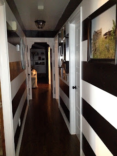
Stripes and hallways are the perfect mix.

Hello again!  I am very excited about this post because its about my FAVORITE room (is a hallway a room??) in the house!!!  It might make you dizzy.  Stripes are everywhere nowadays,  and I love them all.  Especially black and white stripes.  Before we even bought our new house, I knew exactly what I wanted to do to the hallway.  I just had to talk B into it:)  Luckily for me, B is as crazy as I am when it comes to drastic changes to the house, so it didn't take much convincing.  What it did take however was a very patient husband, and lots of time.  Getting everything level and making sure the spacing was  even was the worst.  But all totally worth it.  We have SEVEN door ways in the hallway alone, so matching up one side to the other was hell..but B did it, and did it perfectly.  Like I had said in a previous post, the first thing we did was scrape all the popcorn ceilings.  So, we are just texturing the ceilings as we go room by room.  But in the hallway, the walls were texture of the 80's, so there was no way to get perfect straight lines.  B had to go back and texture the walls TWICE to get them really smooth in order for my project to work.  Needless to say, there was so much prep work that went into this damn hallway before there was even a paint brush involved.  He's a champ.  After texturing until his hands bled (haha, he over exaggerates) and priming the hallway and ceilings, the walls were ready!!


This is the before picture...after all the texturing and priming was done.  We also are replacing the doors, 7 alone in this hallway, and painting all the wood work.   For all the white woodwork, we are using a high gloss white in Behr.  I love high gloss on wood work, it makes it super easy to clean, and the finish looks amazing!!  The white on the walls is Behr satin ultra pure white, and the black stripes are Behr high gloss black.  I wanted a contrast in paint finish to make the black really pop.   Notice the 'boob' lights.  Haha thats what they remind me of.  Those came down also by the end of the project!


Thats me, and at this point I'm a little freaked out that this is actually happening!! But B was not letting me back out because as you can see, he has already started taping off and spent 3 hours wanting to kill me:)


Almost done!!  We just had finishing touches to do, change out the light fixtures, and start hanging pictures!!  


I found this awesome teal and white mirror at the flea market, and the frames are a mixture I already had, along with some new ones from Ikea. One more thing I'm obsessed with currently is gallery walls.  I love the mixture of hanging matching or mismatching picture frames, or any thing thats hangs really!  Don't be alarmed by the upper left hand picture...it's fake!  I tagged along to a photo shoot  where Brock was a zombie, and afterwards I jumped into a few of the pictures!  If you didnt already know,  I love Ikea.  You can get some amazing deals and its a great place to buy things to mix and match in with more pricey stuff.  I love mixing old with new, and I never want a room to look too "new".  I hate that feeling.  I shop flea markets, antique stores, and the Salvation Army in Moore is our favorite go-to place for treasures!  Don't get me wrong, I LOVE buying new shiny things from places like Z gallerie, Ballard Design, Ikea, and West Elm, (just to name a few, and almost always on sale!), but I always try to mix them in with old accessories and vintage finds. 


Monday, March 4, 2013

I have a love/hate relationship with wallpaper. Oh, and this is also about our guest bath renovation.

Hello! So as I'm sure from the title of the post you can tell that I've had to deal with wallpaper.  Unfortunately for me, its not just in one room of the house.  But more about that later.  This was the first time I have ever had to tackle taking down wallpaper, and I've decided it would have been easier to burn the house down.  Not only was there one layer, there was two, and honestly maybe even three. When we bought the house, the MLS listing picture of this bathroom is very deceiving because it just looks like blue paint....right? This is that deceiving picture..
The pros of this room were:
Granite counter top (which I was so thankful for bc I would have never spent the money on for the bathrooms)
The cabinets were still in great shape..so we got rid of the 80's stain, and camouflaged the wood paneling
----Thats about all the pros I can think of...and too many cons to list!

When we bought our house, we knew we were going to re-do every room.  We vowed to try and do most of the work ourselves, and hopfully achieve the exact look we wanted, while TRYING to stay on a budget.  I randomly picked this room to start with.  I only have one true "before" picture (above) because Brock's computer crashed and we lost tons of photos.  Sucky.  I have a couple of the mid way through photos...AFTER the three weeks of scraping and tearing down the worlds most stuck on wallpaper.  We ended up using a texturing tool,  water bottle, and lots of cuss words:)  But finally it came down....what also came down was most of the dry wall because I got carried away with the water bottle.  So, after Brock patched holes, taught himself how to texture the walls and ceiling, (oh yeah, the VERY first thing we did was scrape all the popcorn ceilings throughout the house...oh my, kill me now) sanded the wood work, and I primed every inch of the damn room, this is how it looked...

We are kind of going with a 'beachy' theme throughout the house...I mean, if you live in Oklahoma with a pool in your backyard, you basically live at the beach right?  So in here I wanted to use cool, bright, light colors. I have been wanting to do a room where the trim and walls are the same color, but I was nervous to do a dark saturated color on the trim and walls, so I knew this was the room to try it in.  We used Wisteria Snow in semi gloss by Valspar for the walls, trim, and wood paneling...which I have come to love:) 
We used navy blue for the vanity and cabinet over the toilet.  I think I had it color matched, so Im not sure on the color.  Oops.  But, I love the two blues together!!  The shower curtain and bath rugs are from West Elm, on sale.  I hardly EVER buy anything unless its on sale...thats how I trick myself into pretending to save money.  The mirror is recycled from our old house...I spray painted it glossy white.  I love spray paint.  I spray paint everything.  It started out gold, went to matte black, now to glossy white.  We replaced the cheap white light fixture with recessed lights, took out the heater and added a chandelier.  It was an antique store find, already painted red.  Score.  The shelf is from Ikea.  Craziest place on earth.  And all the art work is original..especially the bird drawing that I somehow managed to paint after too many glasses of wine.  If you notice, B made me hang it BEHIND the door.  Haha.  The screen print is of my grandmother that my very talented cousin Lindsey did, and the dog drawing is something Brock drew for me.  I found a similar one on pinterest, so he recreated it with our best friends dogs along with our own.  Its just one of the funny quirky things I love about our house.  The knobs are from Anthropologie, which to be honest took me a couple trips up there to finally pull the trigger.  They were not on sale, and in my opionion not cheap compared to HobLob, but I just HAD to have them.  I think they make the vanity look even more amazing, so it was totally worth the money.  For this being the first room we tackled, I love the way it turned out!! 


We replaced the old flat bathroom door with a white gloss five panel door, and luckily we have a huge deep linen closet in this bath.  I was planning on replacing this door also, but came across this image from pinterest. (right) This is not something my handy hubby wants to try and take on, so we are hiring a carpenter to come and build this in. I'm super excited about it! I think it will add that much more character to the room!   Built In Linen Shelf

This stuff is. the. bomb.  It wasn't in our budget to rip up and replace the tile, so I had to come up with something to distract you from the floral flooring:)  This grout refresh is amazing stuff.  You apply it to the grout lines, use a toothbrush to smooth out, let dry for a bit, and wipe off excess.  It took our nasty  dark dirty grout, to pretty clean light colored grout!  Biscuit colored to be exact. 
I dont have a before picture of the grout in that bath, but it is the same as the grout in our bath..so here is that pic..then the after.  I mean, like night and day.  Looks 100% better!  By far the best $9 we spent! 


Sunday, February 24, 2013

getting to know the Lays

Welcome!  This is all very new to me, so it may take a while for me to get the hang of things. I have been wanting to get in on the blogger world for a while now, and I'm happy I'm finally getting around to it! My husband and I have been married for almost three years in June.  We have three high maintenance dogs. Lou, a three year old pomeranian, and two english bulldogs, Matilda (4) and Elphaba (5). Yes, like the witch from Wicked. I'm impressed if you knew that.  Brock (the husband) is a graphic designer, and has a pretty bad ass Etsy shop, www.etsy.com/shop/BrockPaperScissor . Check. It. Out.  I have been a hairdresser for almost 9 years.  Whoa, thats weird to say. Or type. Whichever.  I love my job, and I'm so happy that I don't mind getting out of bed and going to the salon everyday.  Even though, to be honest, I don't love getting out of bed.  I love sleep.  Luckily for me, so do my overweight lazy bulldogs.  In my spare time, when I am awake,  I have become mildly obsessed with interior design, and I truly believe that in a past life that was my profession.  I can not get enough of every home design magazine out there, and Pinterest literally takes my obsession to a whole new level.  We bought our second home together in April of 2012, and have been working non stop trying to rid the house of the 80's feel ever since.  I actually love it more than I can explain.  I love the crazy, stressful, expensive, rewarding process of it all...even though it will be a tiny wee bit longer until we are finished. (and by 'tiny wee bit' I mean forever) 

Elphie, the one on the right, has a never ending bit of paint on her.  She is very helpful and curious when it comes to ANYTHING we are doing around the house.  She is constantly in the way, with a screw, paintbrush,  or whatever piece of hardware we are frantically searching for, in her mouth.  She especially loves chewing on the many painters tape rolls we have hanging around the house.  Matilda, (left) is the total opposite, and is scared of every noise, paper, new person, she comes in contact with.  Lou, the pom, just goes with the flow, loves barking at her duck friends that have made our pool their nightly hang out, and can never ever get enough to eat.  These lucky ladies are our children.  For now. At least until we don't have screws, paintbrushes, and painters tape thrown around the house.